Concepting & Planning
Me and 3 other designers got assigned to design a tactical turn based game.
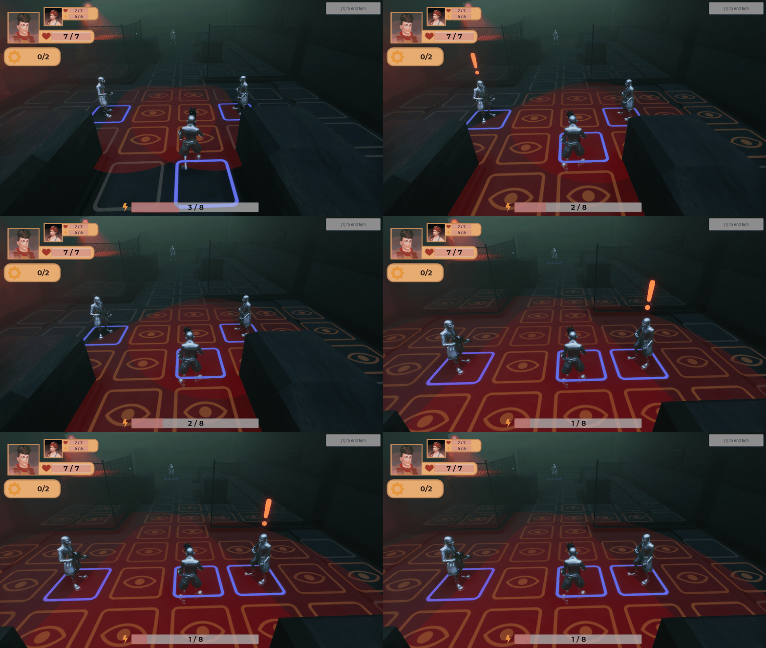
We decided to go for XCOM as our main inspiration, but we decided to have the camera be third person as the main USP. This emphasized the tactics more over strategy as this hides more information from the player while also making the immersion a stronger factor.
My role was UI Lead Designer, so I did research into the seed of our game and player persona’s. I also took responsibility of the camera, I originally wasn’t convinced that the game needed to be 3D and that it could’ve been possible to recreate the same gameplay with a fog of war system. I looked at Darkwood as my main inspiration as I felt that game was extremely immersive while being a 2D top-down game. During my research/testing I did realize that this system emulates first person camera’s instead of third person, which made me appreciate the strengths of third person.
Darkwood Camera Inspiration.
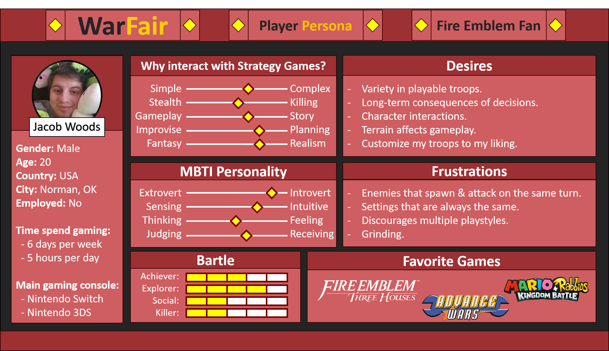
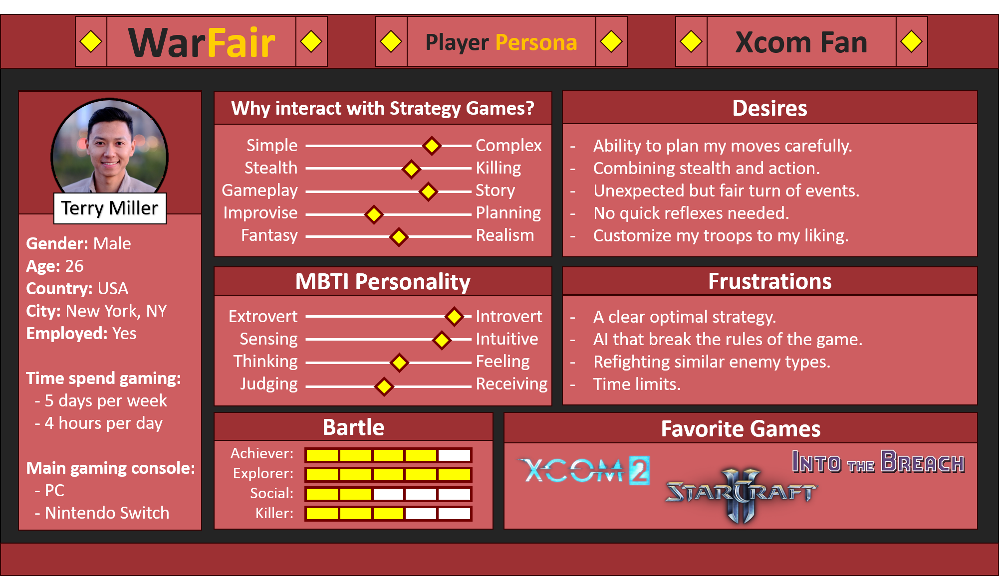
This was the first time I created a Player Persona. I decided to create a player survey and post this on Reddit to ask players of strategy fans their favorite parts of the genre.
This was kind of helpful but I wasn’t very good at asking question yet, my questions were way too direct, a question like “Do you want to be immersed by the world?” is something most people can get behind so it isn’t a very effective question. I noticed that searching through reviews and the reddit was more useful in gathering the information I was looking for.
Player Persona: Fire Emblem Fan
Player Persona: Xcom Fan
Prototyping
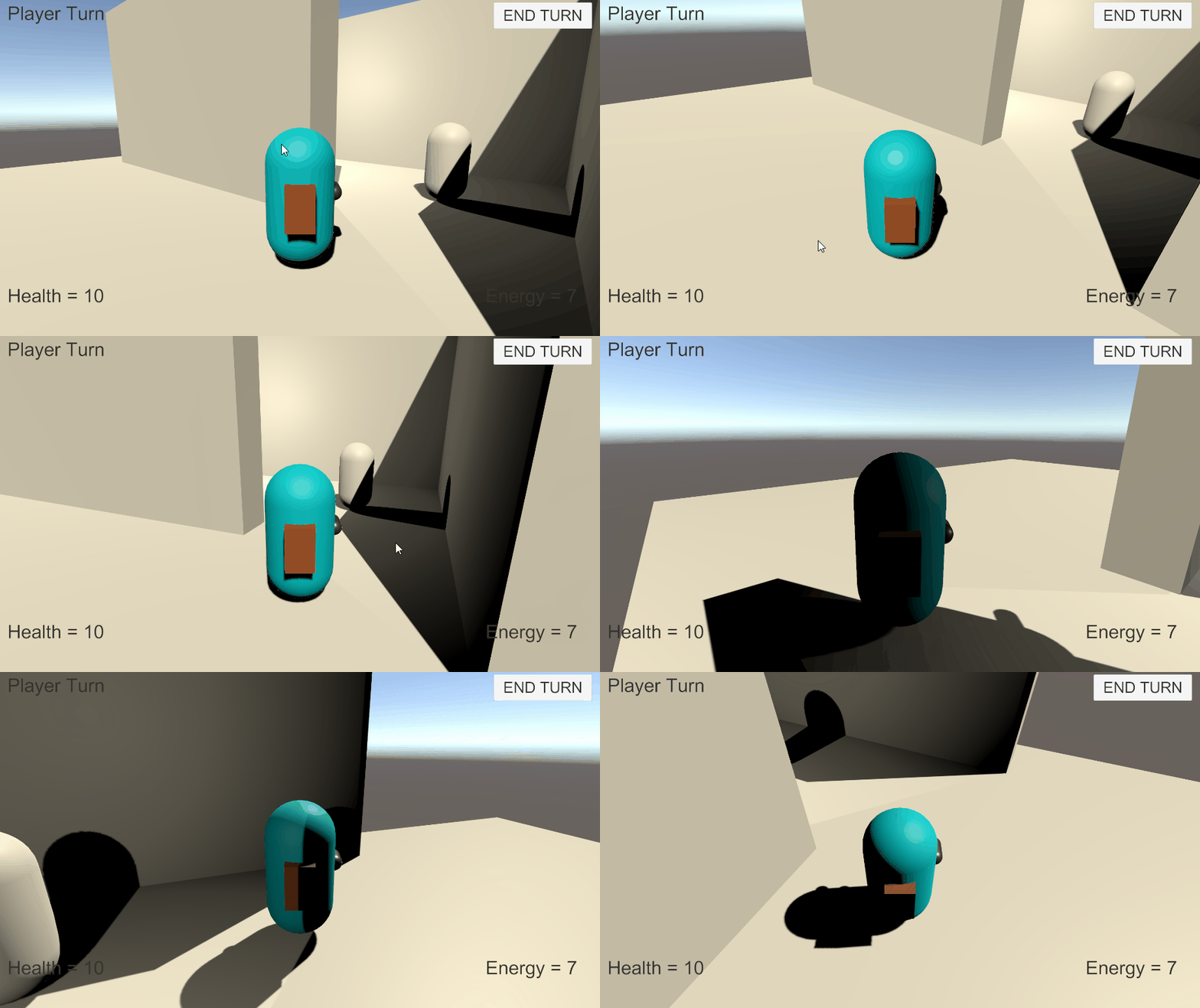
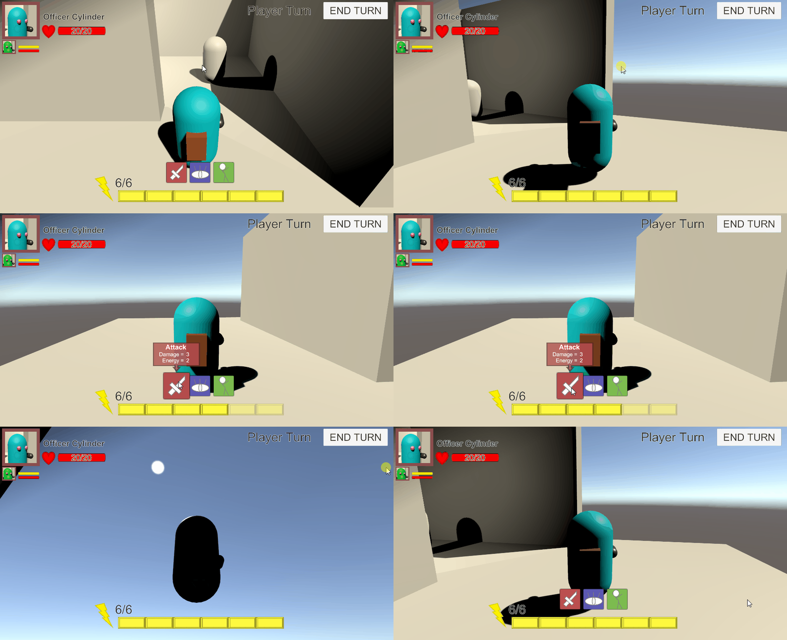
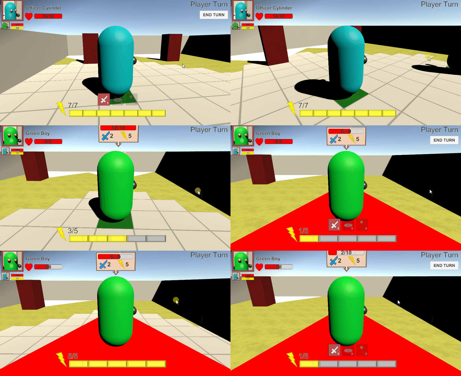
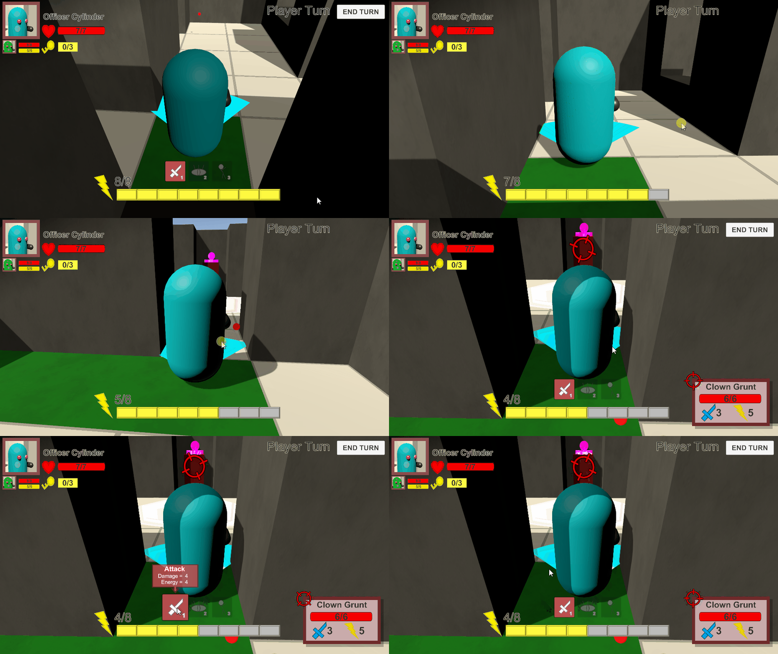
Me and another designer took on the task of prototyping the game in Unity. He focused on getting the enemy AI right and having movement done on a grid system while I focused on the 3C’s (Camera, Character, Control) and implementing the basic UI into the game.
All the prototyping was done in Unity, this is because I was very comfortable with it and it’s a great engine for fast prototyping.
We made quick progress and were able to create the basic gameplay loop we wanted within a couple of weeks.
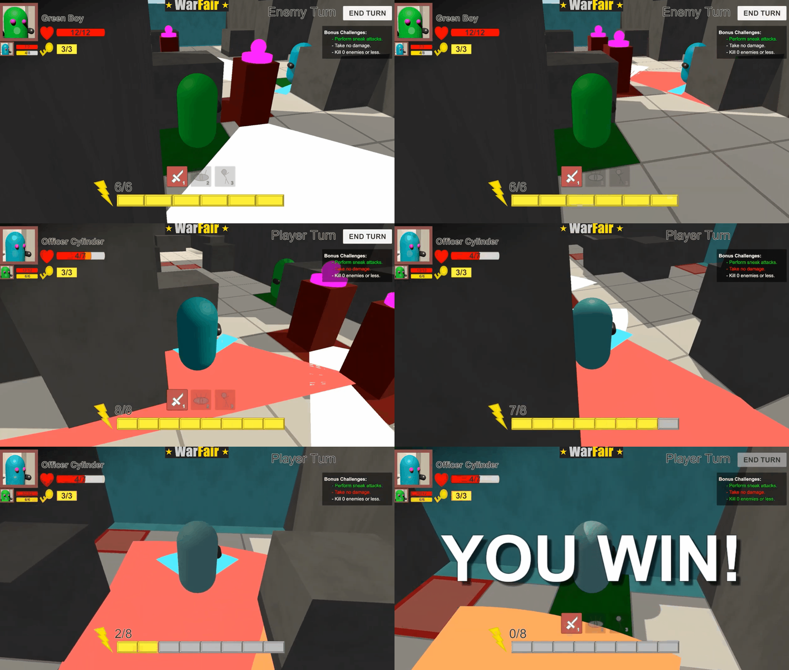
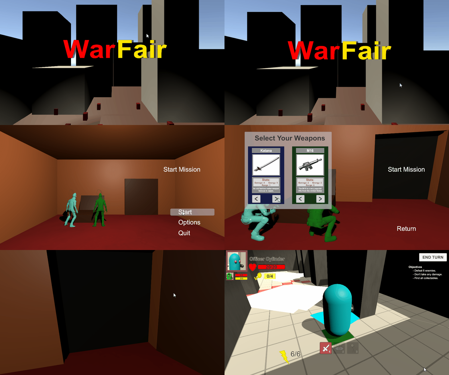
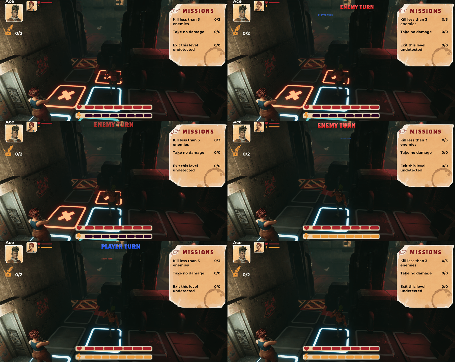
Here you see a progression of the prototype builds with features being added in each iterations.
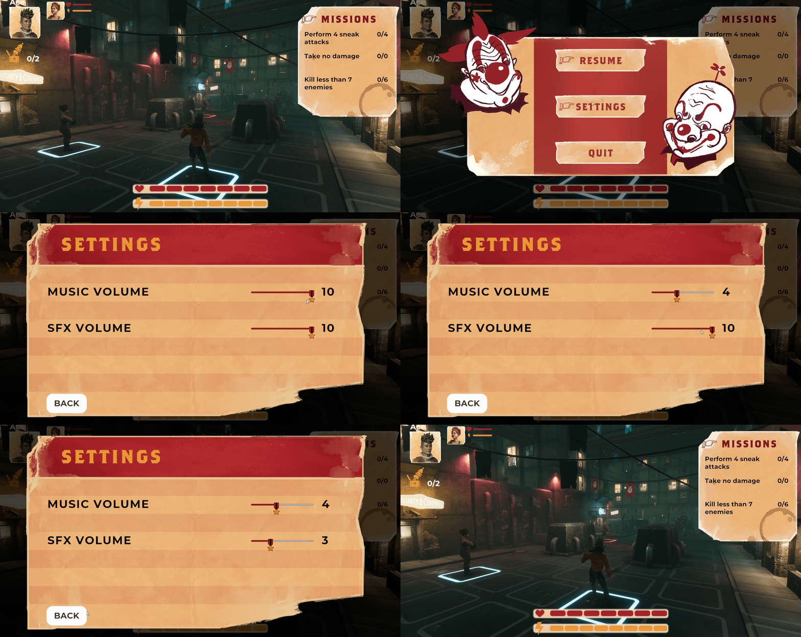
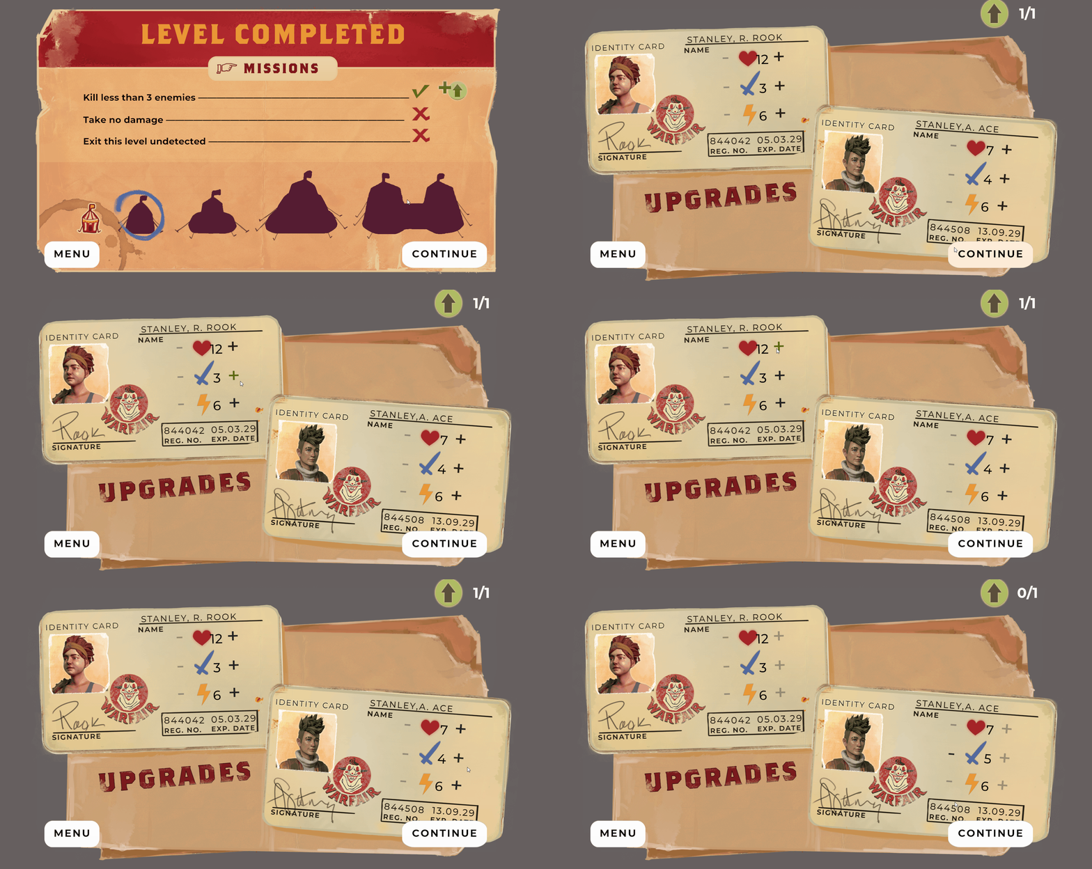
UI Menu Progression
I was tasked with designing all the UI for the game. After the pre-production and at the start of the production phase our project got Artist and Programmers assigned, this had me go over all the UI with both the 2D artist and the UI Programmer. The UI programmer sadly quit the team after the first day and we decided for me to program most of the UI, mainly the menu’s as these are very self contained, making it easy for me to work on as a Designer.
I tried to recreate most menu’s in engine during the prototyping phase to both test these menu’s and to better see some effects in motion like the title card.
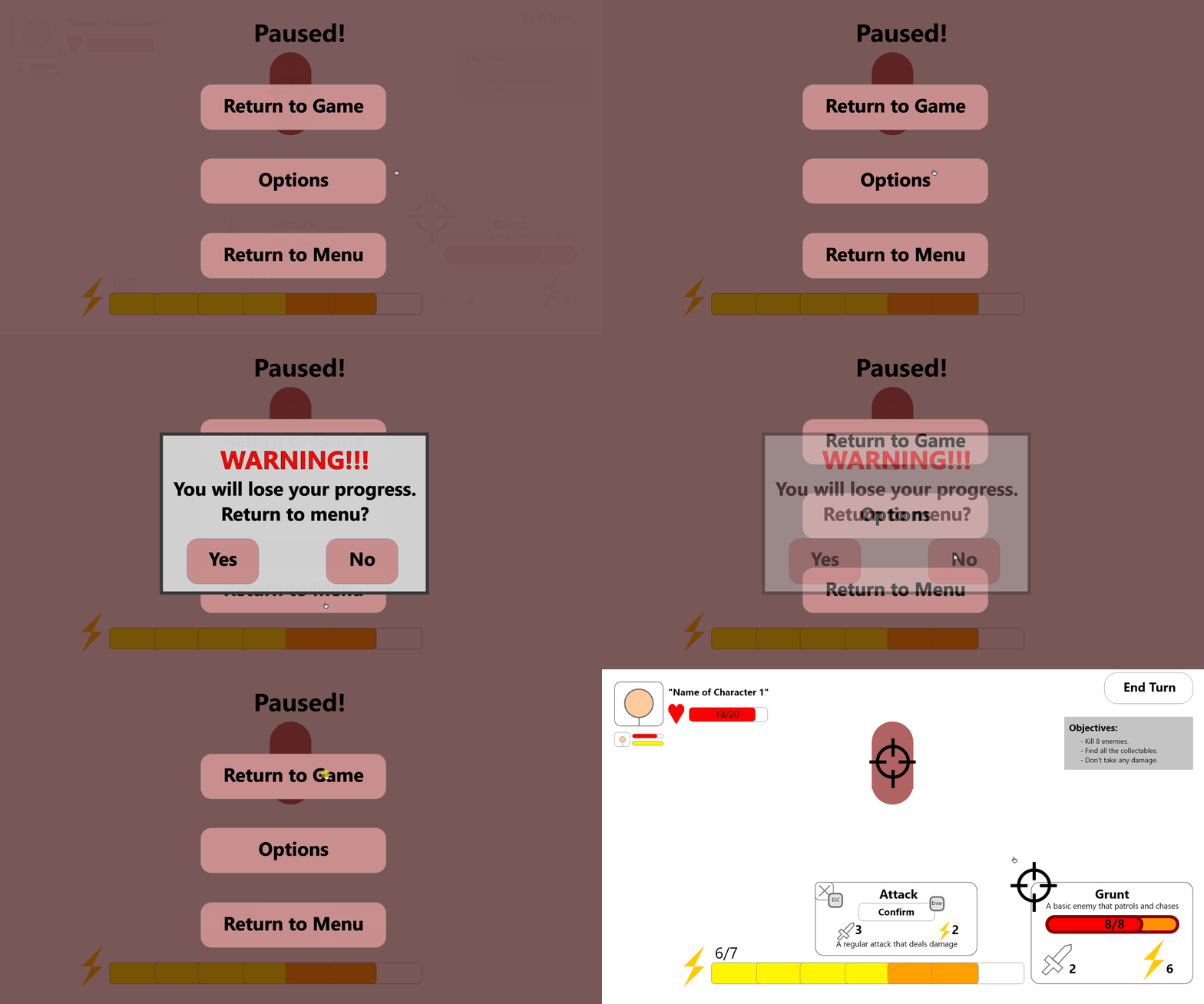
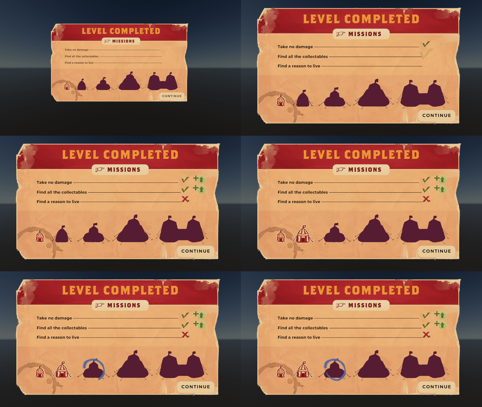
Not all menu’s made sense to create in engine like the pause screen which was rather boring and static. As we didn’t really have a macro gameplay loop setup in the prototype, I created the win screen in Adobe XD.
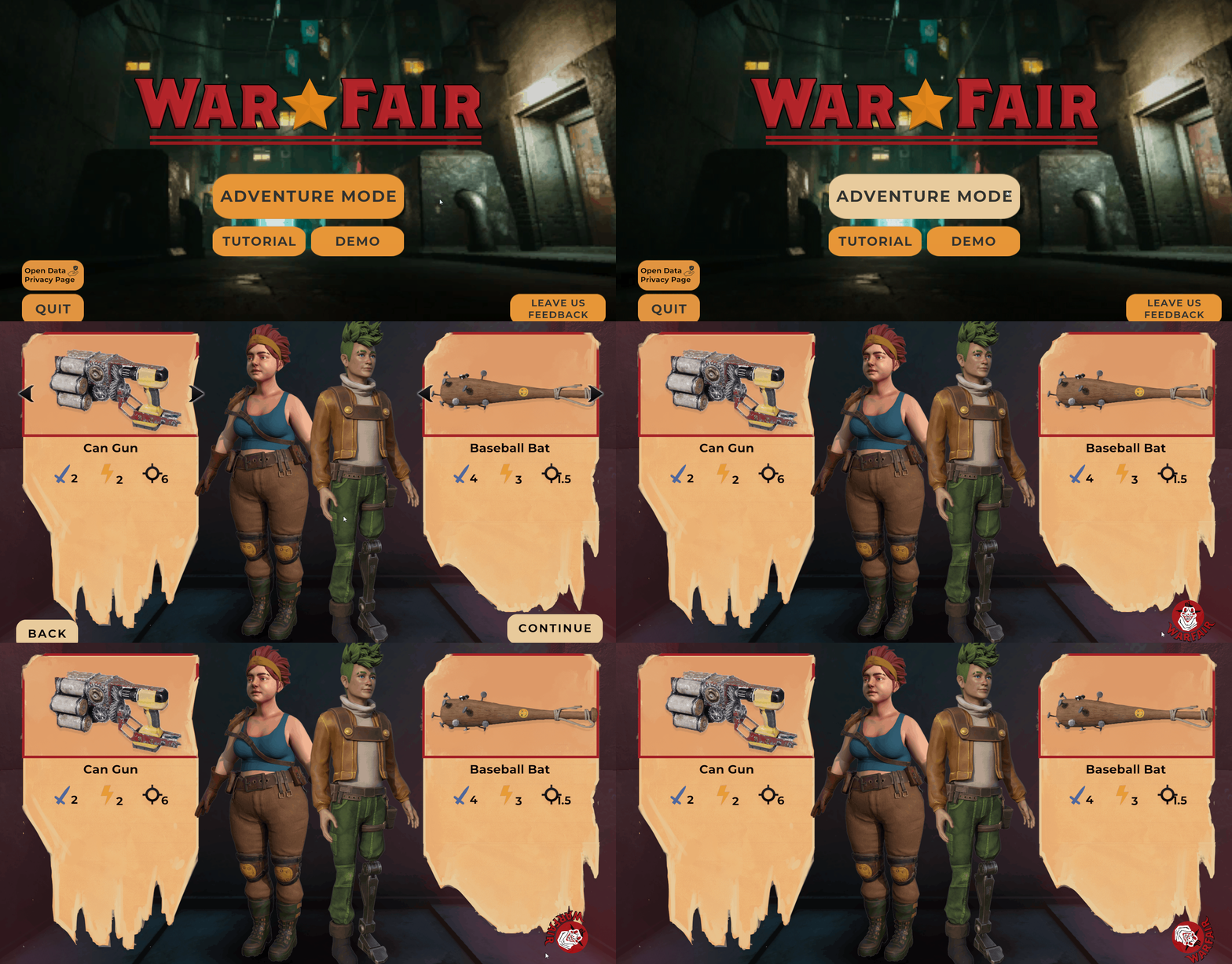
I originally had a larger scope for the Title Screen. It would show the city overrun by the clowns, which are the primary enemies of the game. After pressing next the camera would shift underground to show the 2 main characters preparing their mission underground in their base. Here the player would be able to access options but also switch between their unlocked weapons before going to the mission.
This menu had to be simplified as we didn’t have enough 3D modelers who could spend time creating these assets. The weapon select menu was especially rushed because of time constraints as all the UI had to be created by a single 2D artist within less than 8 weeks.
The pause and settings menu turned out very basic. These screens turned out very bare bones, this is mainly because of scope issues, making it so additional graphical settings couldn’t be implemented and that I was the sole UI programmer making it also difficult to both design and implement these features.
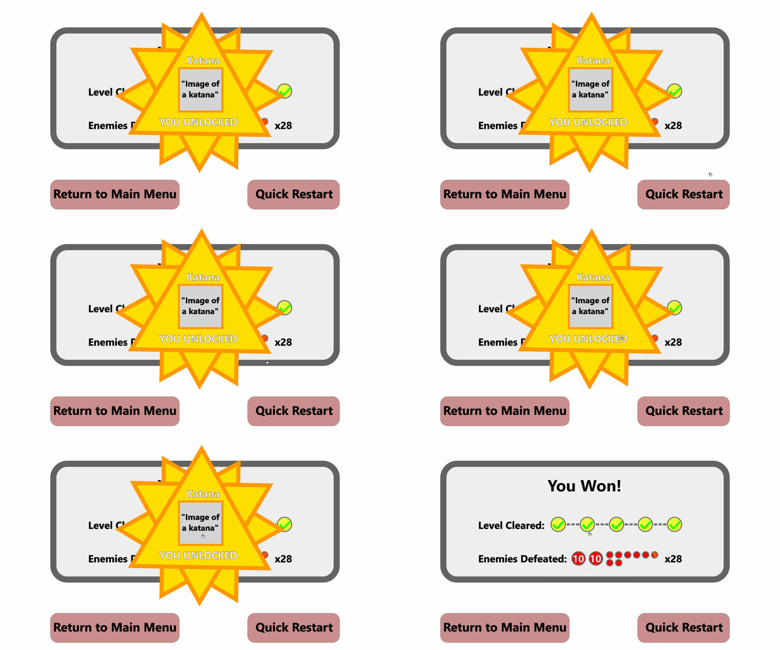
We decided that showing how many enemies had defeated wasn’t that important, so we decided to showcase the amount of mission completed on this screen. While still showing the player’s progress.
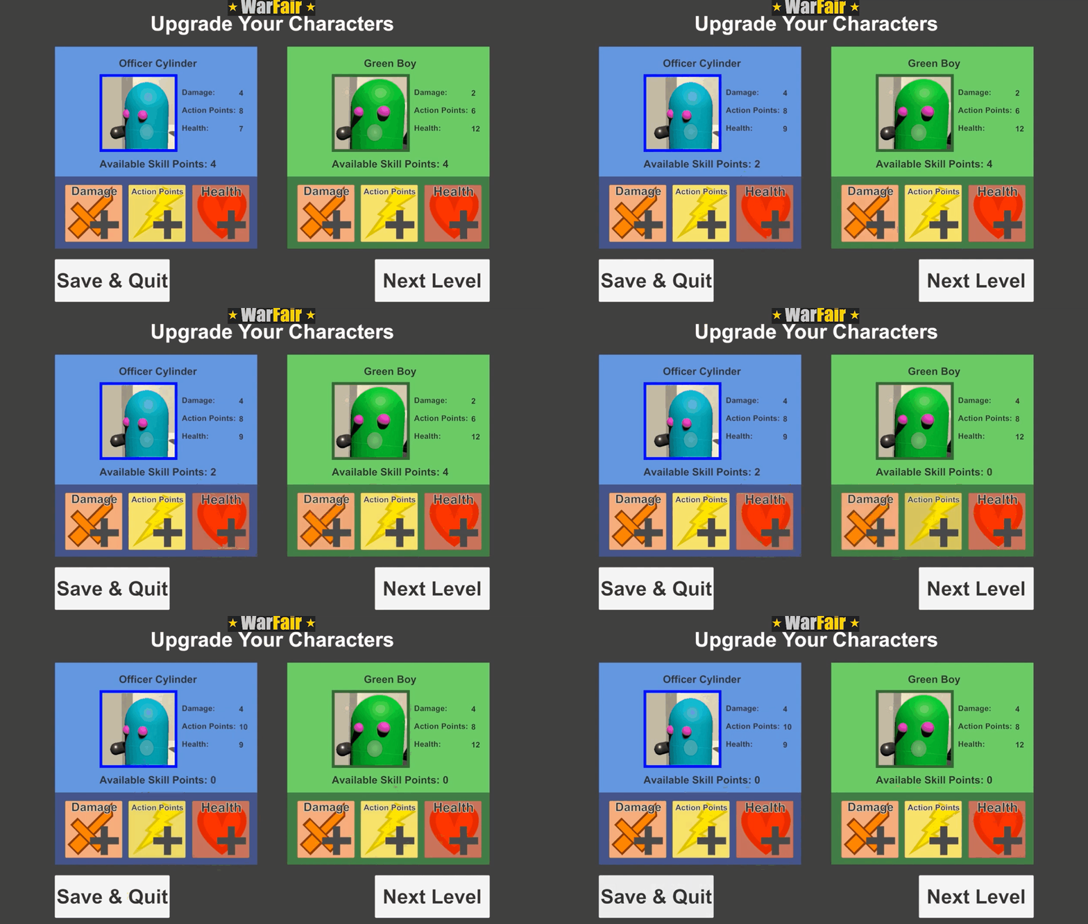
The character upgrade screen got an important upgrade with you being able to take back upgrade points. For the rest the screen the screen stayed pretty similar.
UI HUD Progression
Most of the UI elements stayed the same from my initial designs. Because we had no artists during the concepting or the pre-production phase we didn’t have the best idea how the final game was going to look. I personally think the UI didn’t fit as well as I originally thought it would as the game ended up using way darker colors as I was expecting.
If we had more time I would’ve sat down with the artist to make changes to it and make the whole UI fit better.
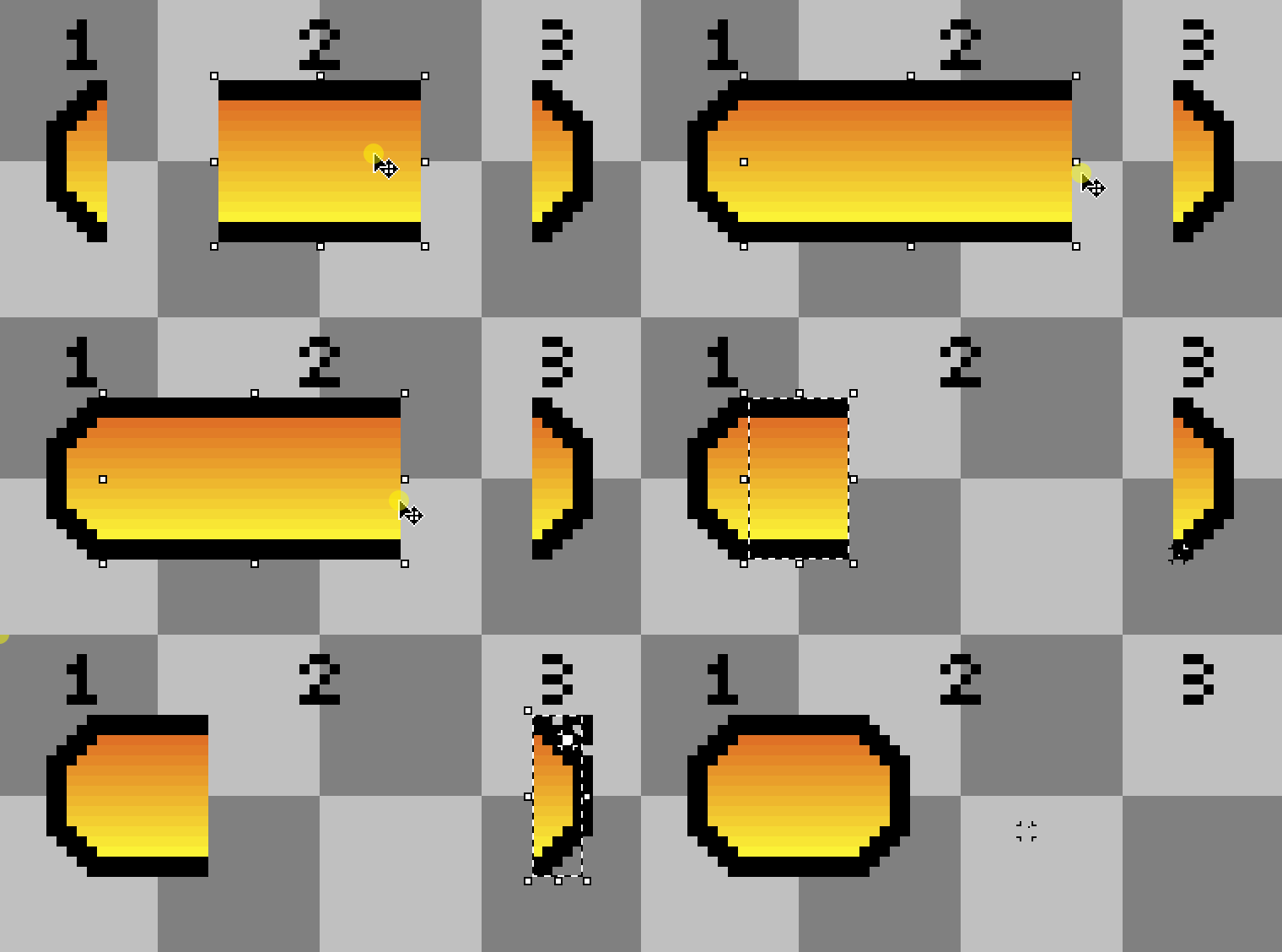
Our HUD elements for health and energy changed size depending on the corresponding amount. I wanted our UI artist to experiment with more possibilities than just have it be a flat color but she thought that was impossible without stretching the design with different amounts.
I created this gif to showcase the possibilities of 3 segmented designs for health bars in this way, but because of time constrains we went for the simpler flat color designs.
Closing Thoughts
Even though I’m not very proud of the end result, I think I was able to showcase my skills as a technical designer well.
I helped in defining the basic gameplay loop, designed all the UI present in the game, helped prototype the game in Unity to showcase my UI in action and lastly I took over as main UI programmer in the production phase where I implemented all the UI and even created some small UI elements like the “!” above enemies.
The biggest problem was scope, with multiple enemies, weapons and features planned to be implemented in little under 8 weeks which wasn’t really feasible.

