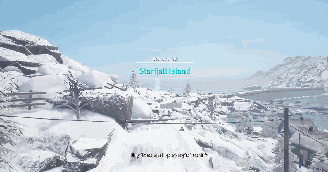
Me and my team (12 people as of now) were tasked to create a open world snow mobile driving game. With the major reference we got to work with being the game Steep.
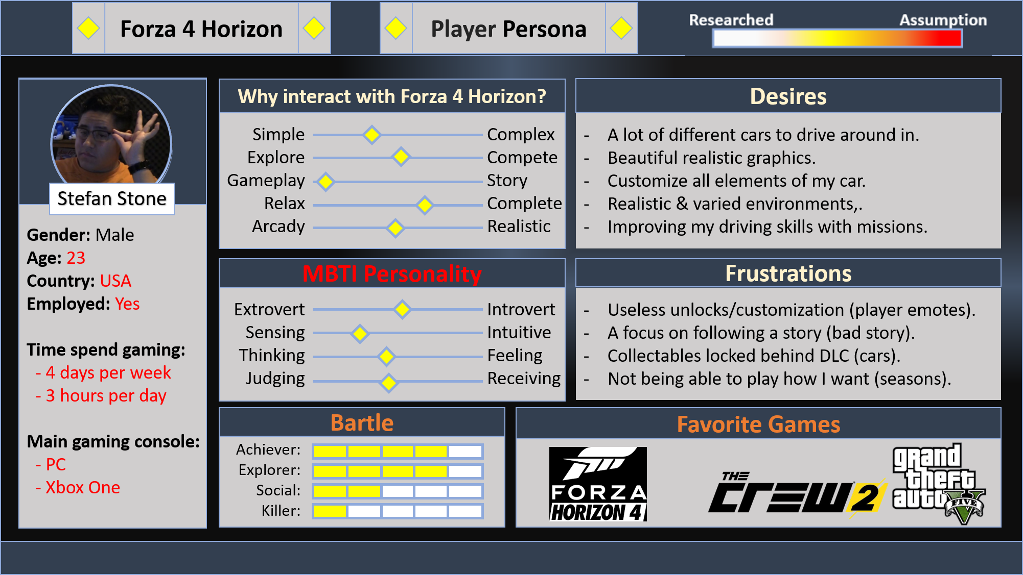
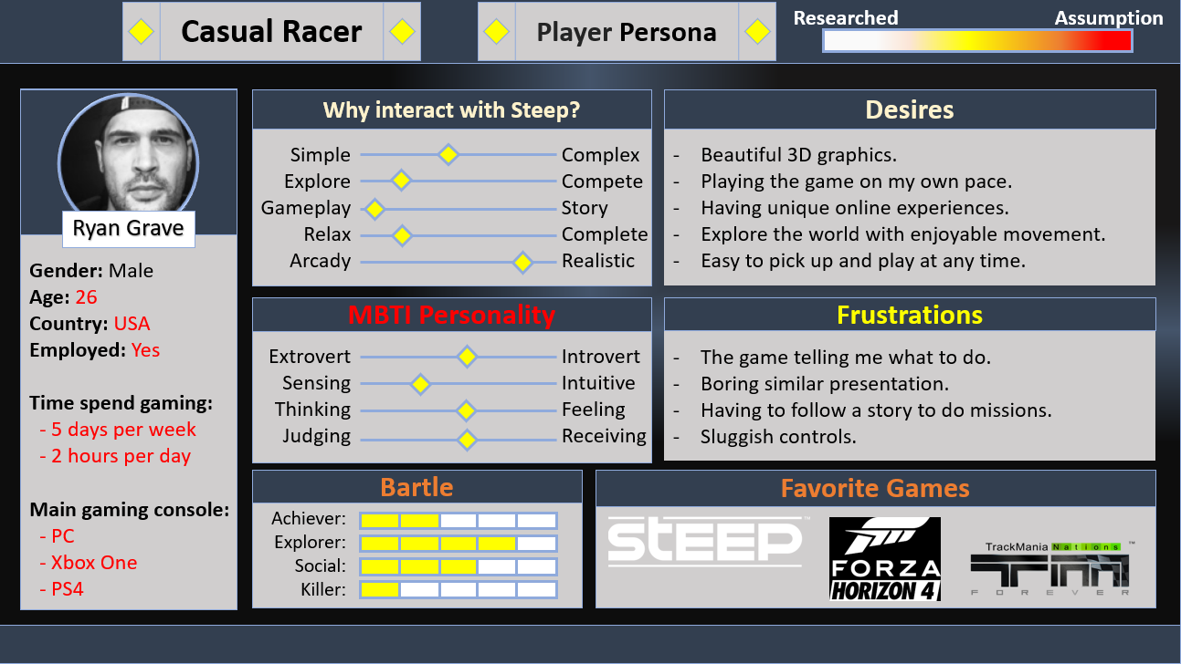
I never really experienced our reference games, just like most of the designers of our team. I created 2 Player Persona’s at the beginning of the planning phase by researching player steam reviews, reddit discussions and reviews by major outlets from the games we used as references. This was mainly Steep and Forza 4 Horizon.
Designing and Prototyping Gameplay UI
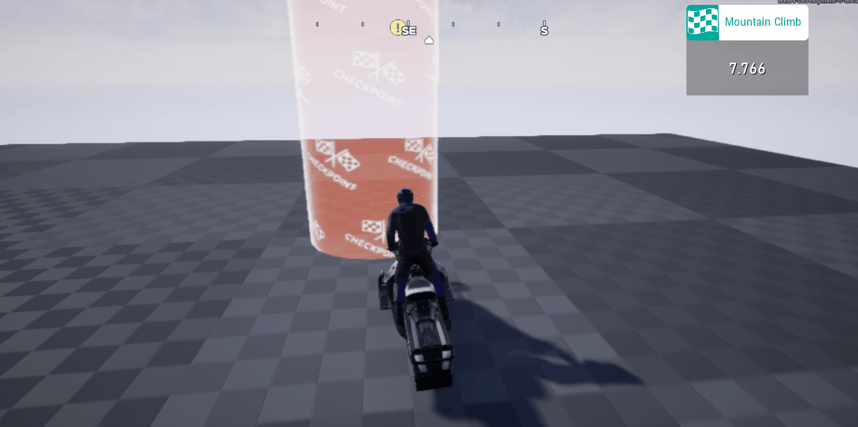
Time Trail Start
Accepted Main Objective
Mission Pop-up
I started with designing and prototyping the mission UI. We planned on having a narrative but not any voice acting so I designed the menu’s in a way to have space for mission narratives. I should’ve spend a bit longer on creating a seed for the UI because there was zero personality or appeal in these first few iterations.
Before we scoped back, our macro gameplay loop had a lot of different types of rewards, so I designed the reward screen with a bit more personality and make it big enough to have the player able to view all rewards. During development however we limited mission rewards to being able to unlock new missions, so I simplified the design to reflect this better. This would allow the player to continue moving as viewing the rewards was unnecessary.
Because our missions are mainly drive from point A to point B we added cinematics to show where the player needs to drive to. This made it possible to show the narrative with small subtitles at the bottom while the camera is showing where to go.
This gave us the opportunity to have a slicker design in the top left for the UI information.
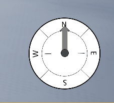
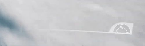
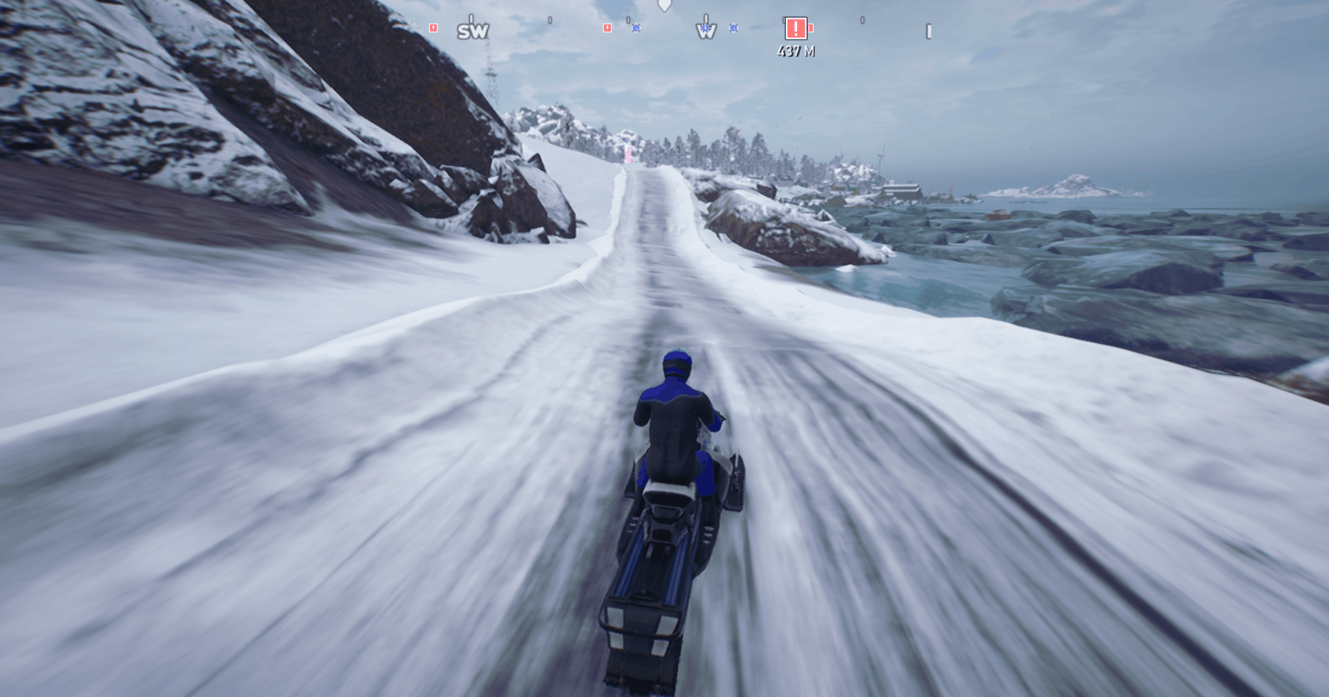
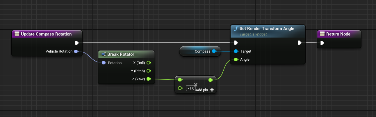
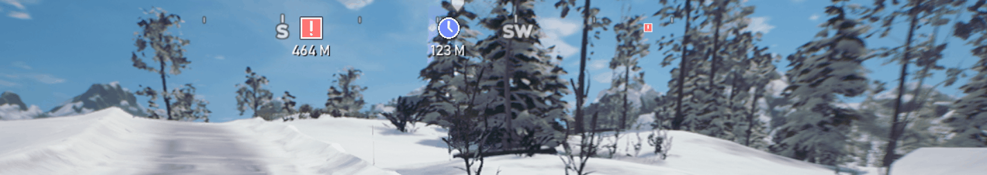
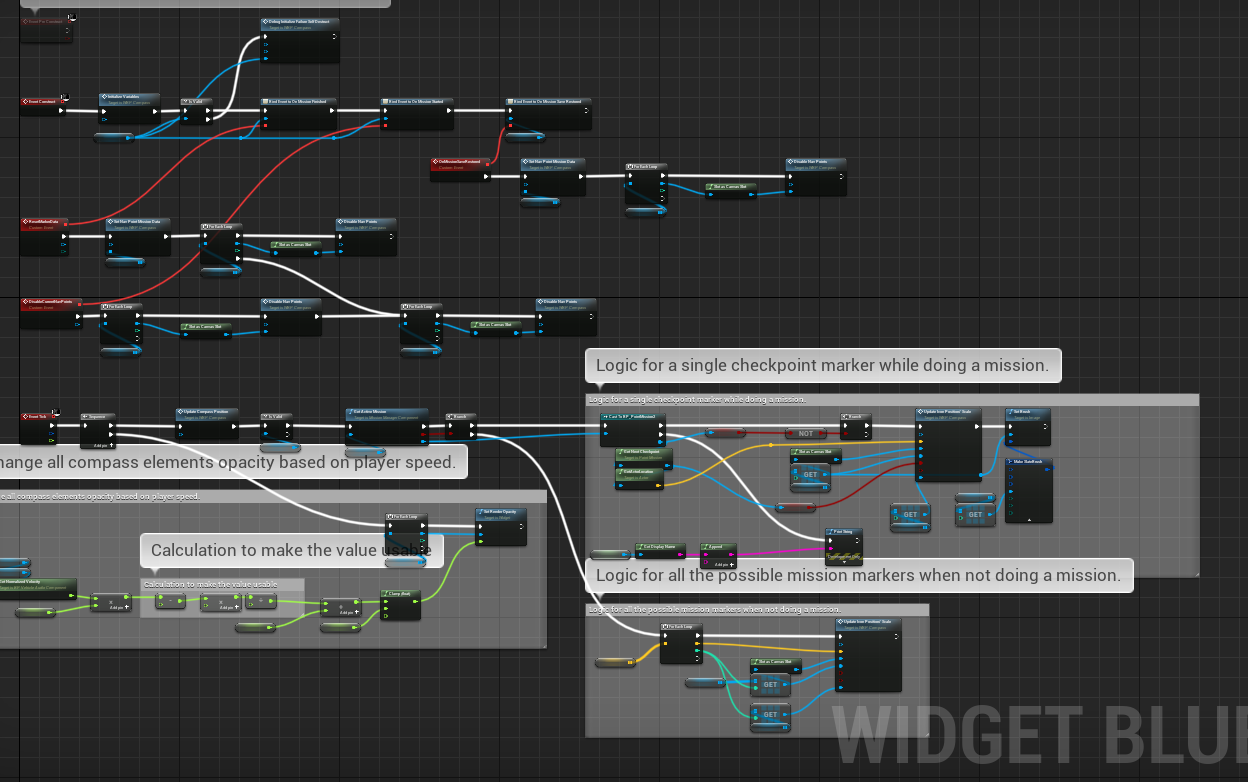
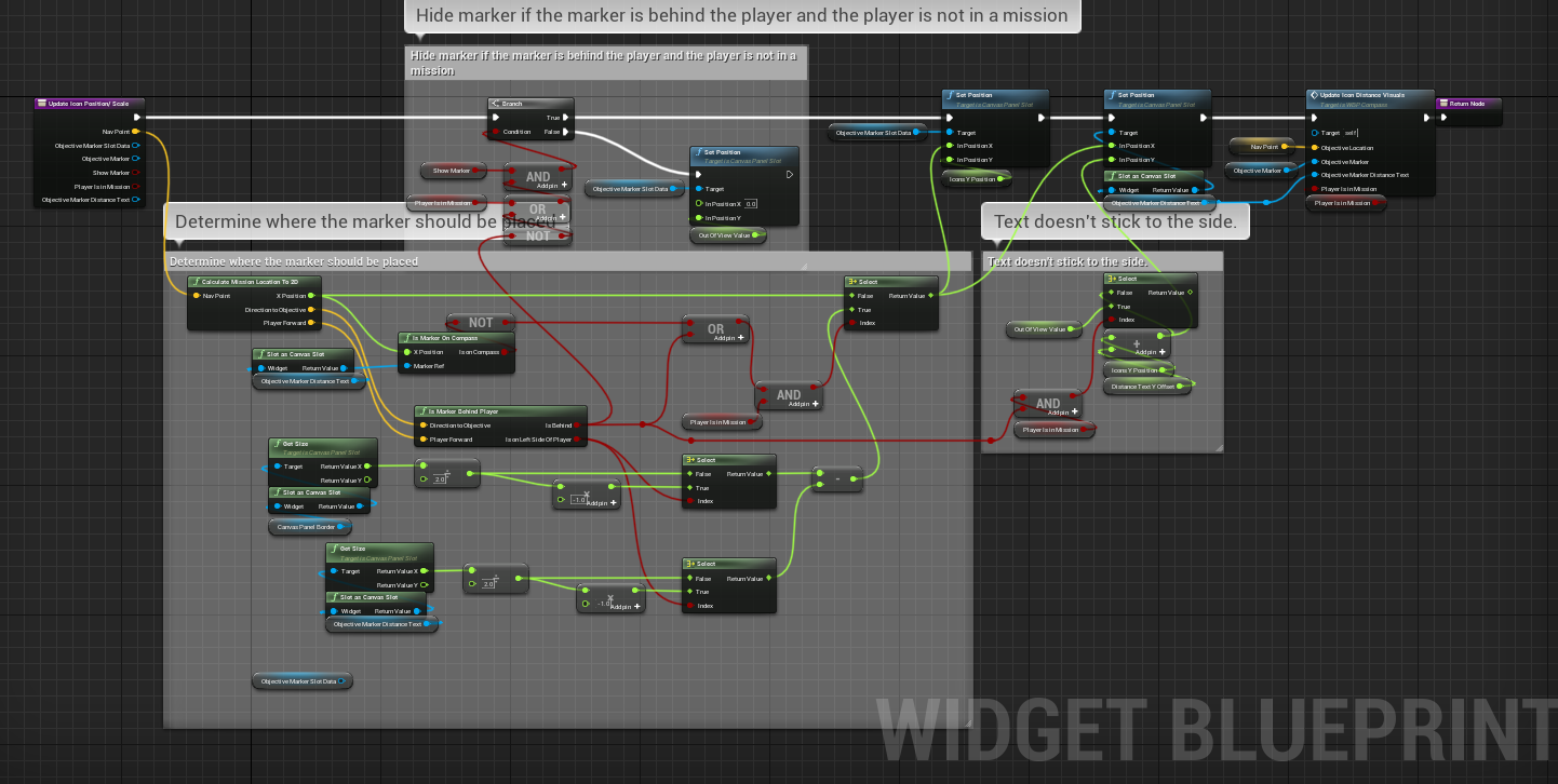
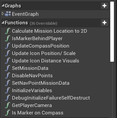
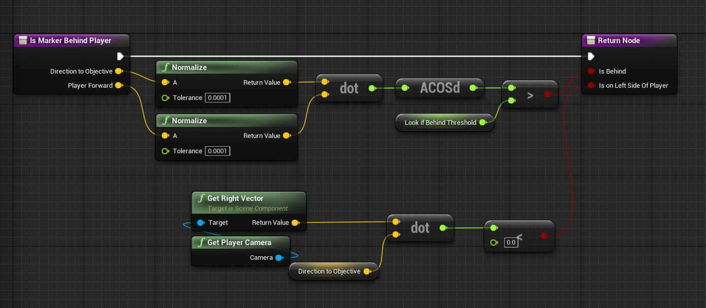
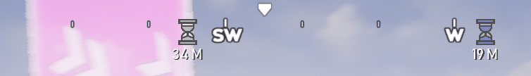
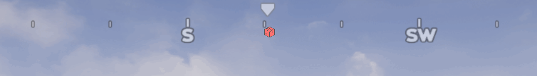
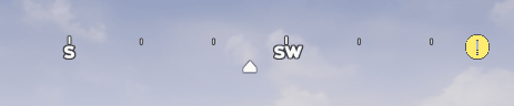
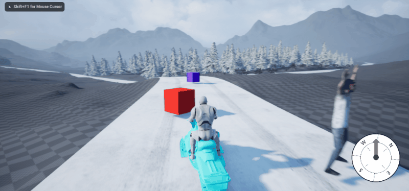
The Compass (HUD)
My role in the team was UI/UX Technical Designer. This meant that I was in charge of both designing and programming all the UI elements.
The compass was originally a very basic component and purely a companion piece to the Map feature, so it would only have the basic rotation. Because of scope reasons we had to cut the map, this required us to expand the compass so we could have the player locate all the missions easily.
The compass quickly became my main focus of the remaining time of development. This mainly included:
Have a scrolling image at the top of the HUD.
Translating the 3D location of missions to 2D images relative to the player position.
Having close by missions be bigger with text below it showing how far away it is.
Switch off mission starts when starting a mission.
Have the active next checkpoint always available on the compass and stick to the side of the compass.
Have mission types separated by different icons.
Only have the 16 closest missions available on the compass at any given time.
Have already beaten time trails be showcased by a grayed out icon.
Compass Development Progress
UI Button Prompts (HUD)
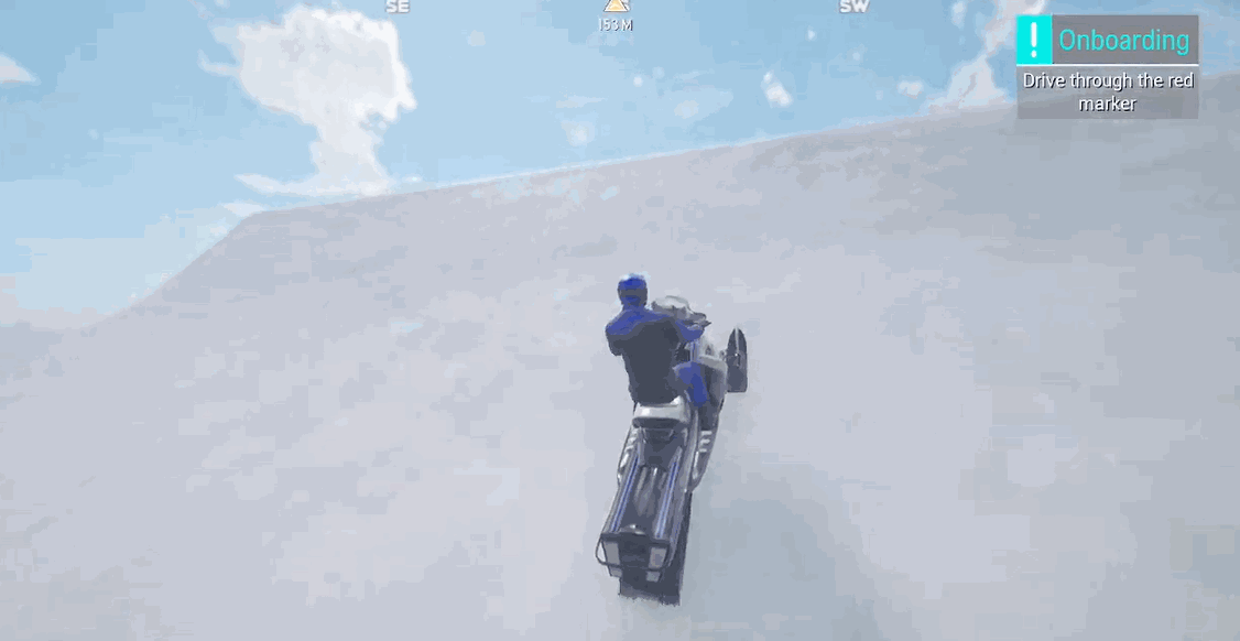
For onboarding reasons we wanted some pop-up windows teaching the players the controls while playing the game.
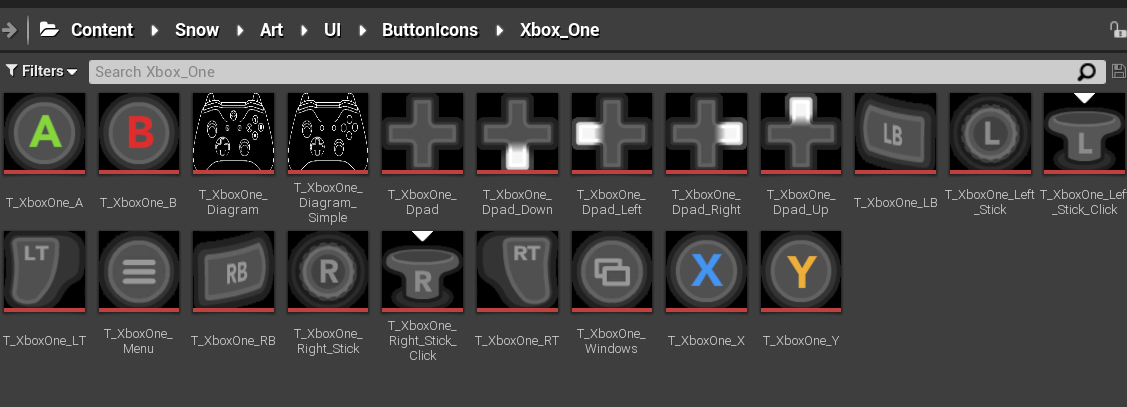
These tutorial windows could mix both normal text and images. Just showing images is easy, but we made it controller sensitive, changing the image depending on the last used control method.
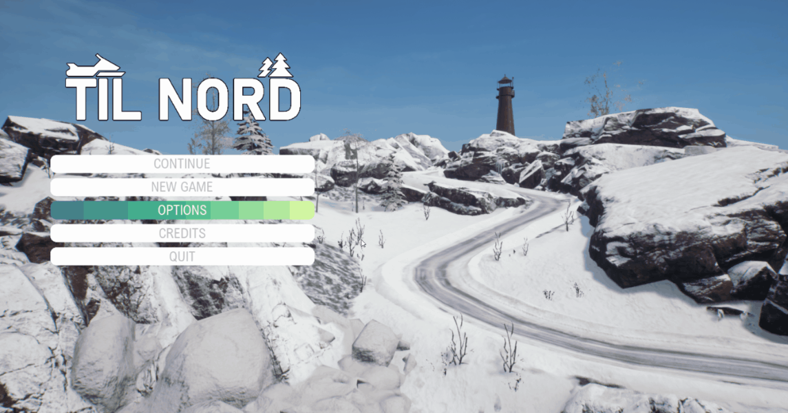
Main Menu Screens
I worked on getting all the menu’s working in game except the pause menu which was created by a different designer.
Credits
Loading Screen
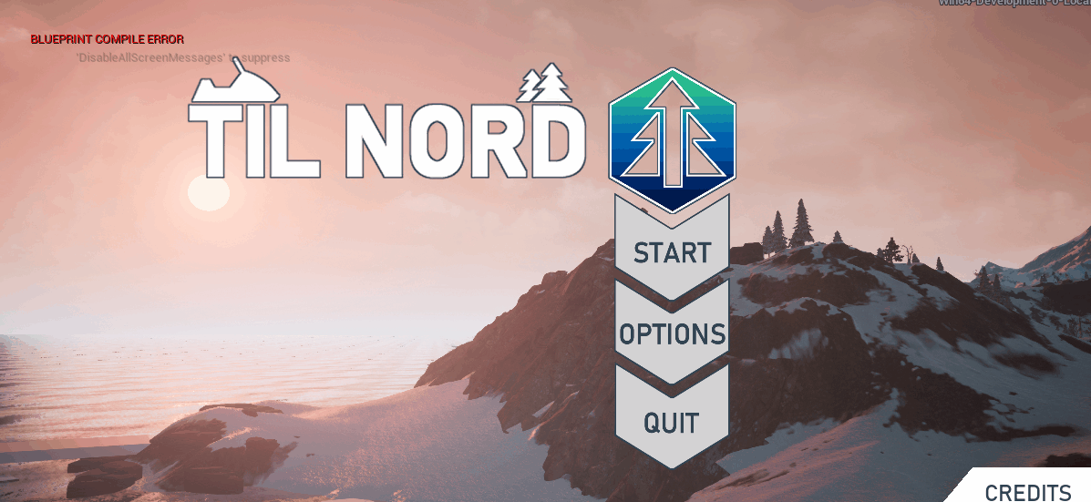
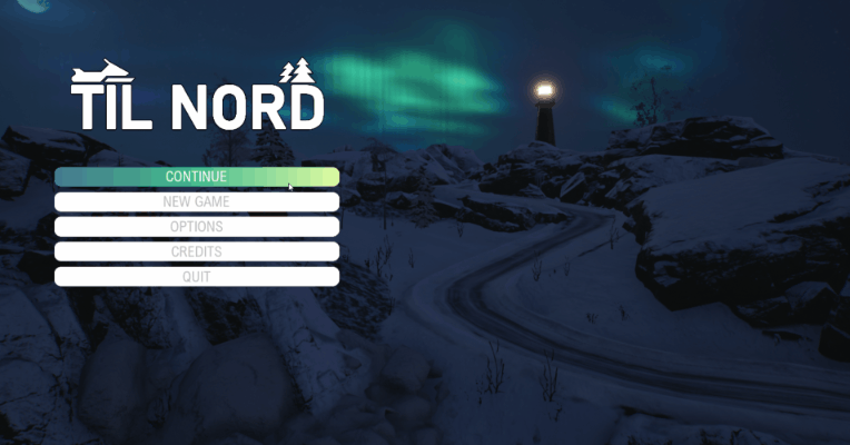
Title Screen
I did do some work on the snow mobile customization screen before the other designer took over. This shows a preview of the skin in real time while the model spins in place. We originally planned on having skins be given as mission rewards but scrapped this feature as we didn’t have time to create that many unique skins.
To create this effect I spawned a cube below the map with the model inside while a camera rotates around it.
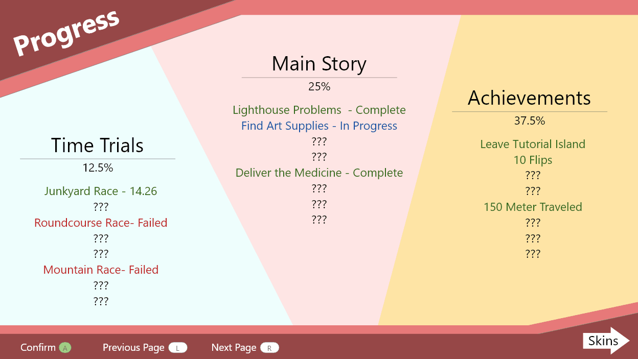
A feature that is missing in the current version of the game which we sadly had to cut was a screen to view your progress. This would’ve had all the missions, time trials and achievements on it to keep track of your progress. As I was busy working on the gameplay UI/UX like the HUD (mainly the compass), a different designer worked on the pause screen and didn’t have enough time to implement a similar screen to this sadly.
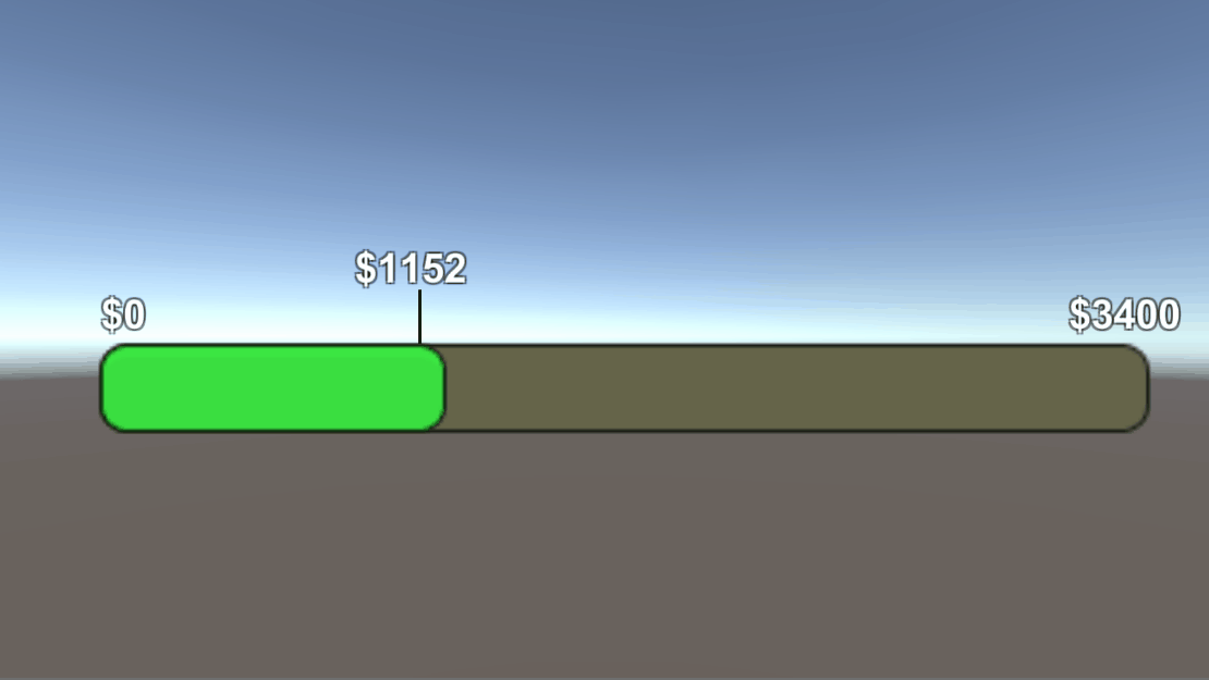
Another feature that was cut was a progress bar showing how much money you still needed to beat the game. This feature was cut because of the changes to the progression system not having money rewards from missions anymore.
Closing Thoughts
I’m very happy with the work I did on this game. As the main UI/UX designer I still see some major issues within the UX like not being able to track your progress which makes the player drive aimlessly without a clear purpose. The main problem I see is not having a map, over relying on the compass makes players travel to their objectives in a straight line from point A to B which can only really be fixed by having either a mini-map or regular map, but this was sadly not feasible within the scope of creating all these features within a year.