For my final year of BUAS I had the choice between an internship or a personal project. I wanted to fully dedicated myself to a personal project one final time so I started working on a initial pitch. I originally wanted to work on a small experiential horror game with voxel graphics and controls calling back to old point and click adventure games like Maniac Mansion (NES). But this idea didn’t pan out as I felt it was a bit too out of my personal scope.
Project House Crisis Pitch
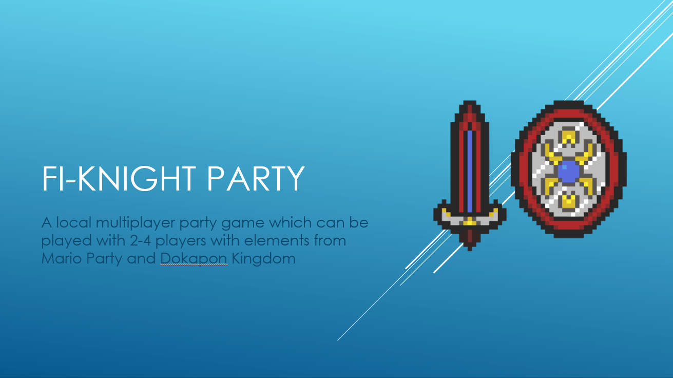
I decided to go for a spin-off sequel to a game I worked on in my final year of Sint-Lucas Eindhoven Infinity Kingdom. This game would be a combination between the macro gameplay loop of the classic Mario Party games but include micro gameplay loop elements from Dokapon Kingdom with it including turn based combat instead of mini-games (mainly for scope reasons.
Initial Pitch Presentation
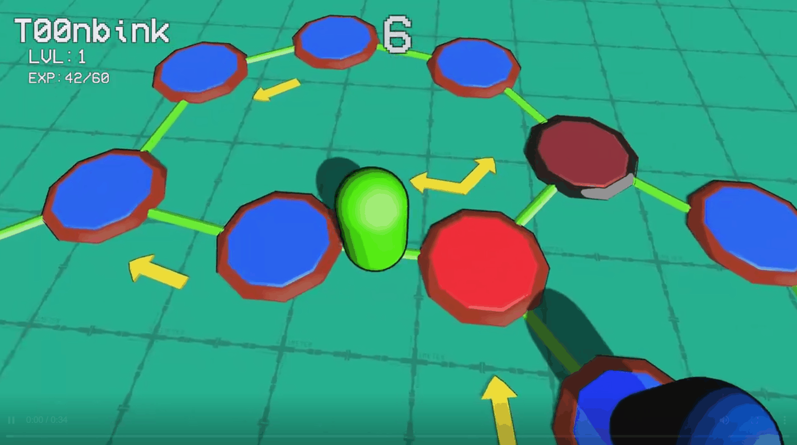
Prototyping
After having the initial concept approved I started prototyping. Because this was a solo project I didn’t only have to prototype the gameplay to see if it’s fun, I also felt like I had to prove to myself that I could create the 2D assets I felt like that was my biggest challenge with this project.
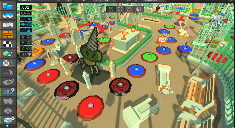
Prototyping Progress
During my prototyping I realized this was something I really wanted to make so I started refactoring my code relatively early on. Separating all systems in their own scripts like the battle system in the Battle Manager, player movement in the Player scripts, etc. I’m more of a front end programmer so creating systems isn’t my strong suit but I was still able to neatly organize my scripts to create a comfortable work environment.
Creating the Visuals
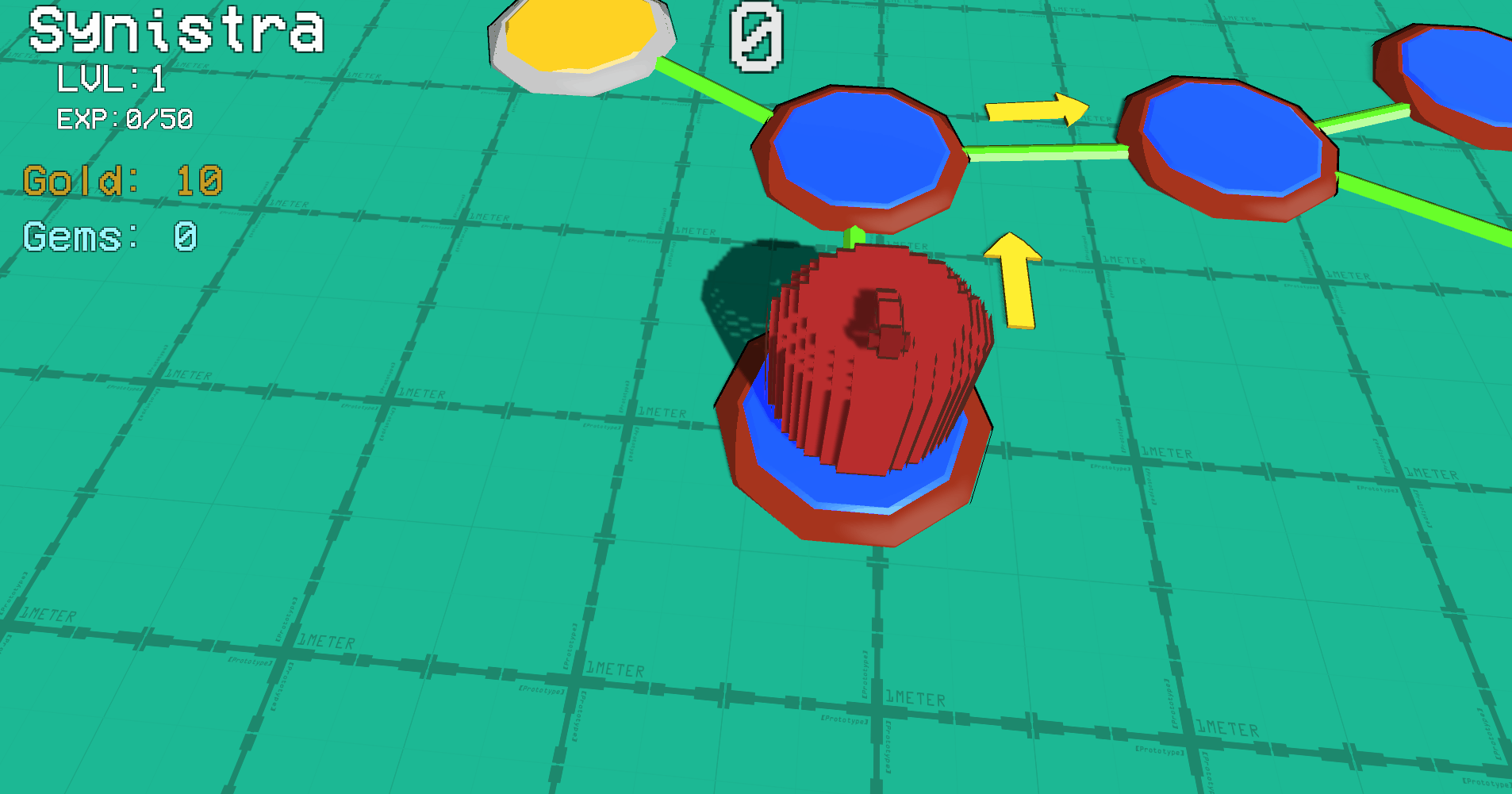
After having the initial concept approved I started prototyping. Because this was a solo project I didn’t only have to prototype the gameplay to see if it’s fun, I also had to prove I could make the game visually appealing. Due to time constrains I decided to combine the two with me creating assets for the UI I was prototyping.
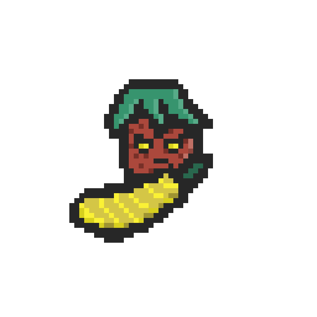
I had some pixel art experience during my time working on Paper Mario 64 custom enemies. Even though my pixel art skills are very one dimensional, I felt the style work well for the type of turn based RPG combat I was creating.
One benefit of my art style was that most art assets didn’t take long to create.
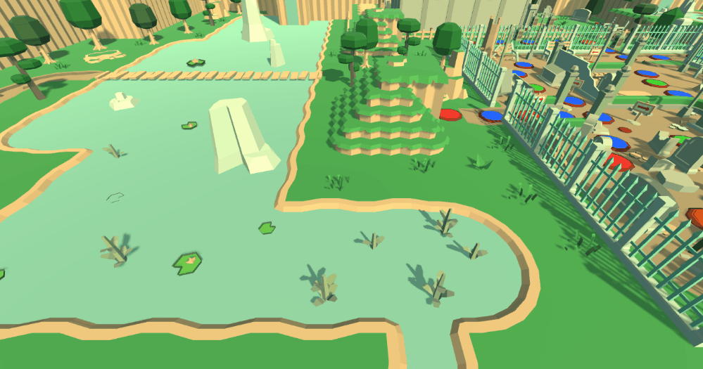
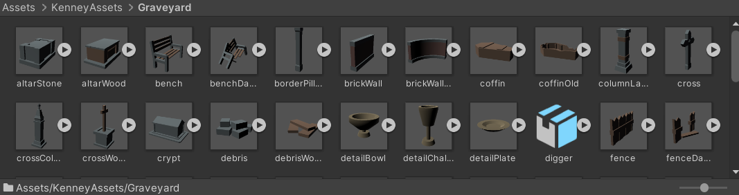
I used kenney.nl for the 3D assets to build my levels with. These assets are easy to work with and didn’t clash with my already created 2D assets. The process of creating my levels was still time consuming but I used both the ProGrids and the ProBuilder Unity plugins to help me speed up this process.
I did have some constrains with having to stay within the limitations of the available 3D assets. Even though these asset packs were very useful, I wish I was able to work with a 3D artist to commission specific assets.
There was also the issue of the logo, I knew this was going to be something very important for the game but also something I knew I couldn’t do justice myself. I decided to commission the logo on Fiverr with good results.
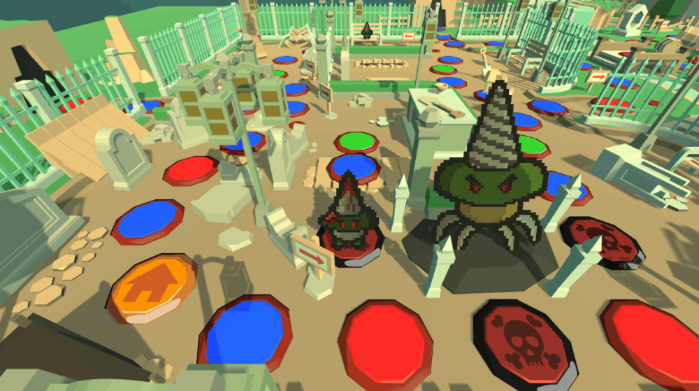
I originally wanted to have voxel models that represented the player that animated throughout the overworld, but I decided to replace this with 2D sprites in the 3D overworld. Because of my prior experience with Paper Mario 64 custom enemy sprites I was already experienced with that art style, my own art style was very similar. So I decided to go full Paper Mario and have
2D sprites walk around the 3D world.
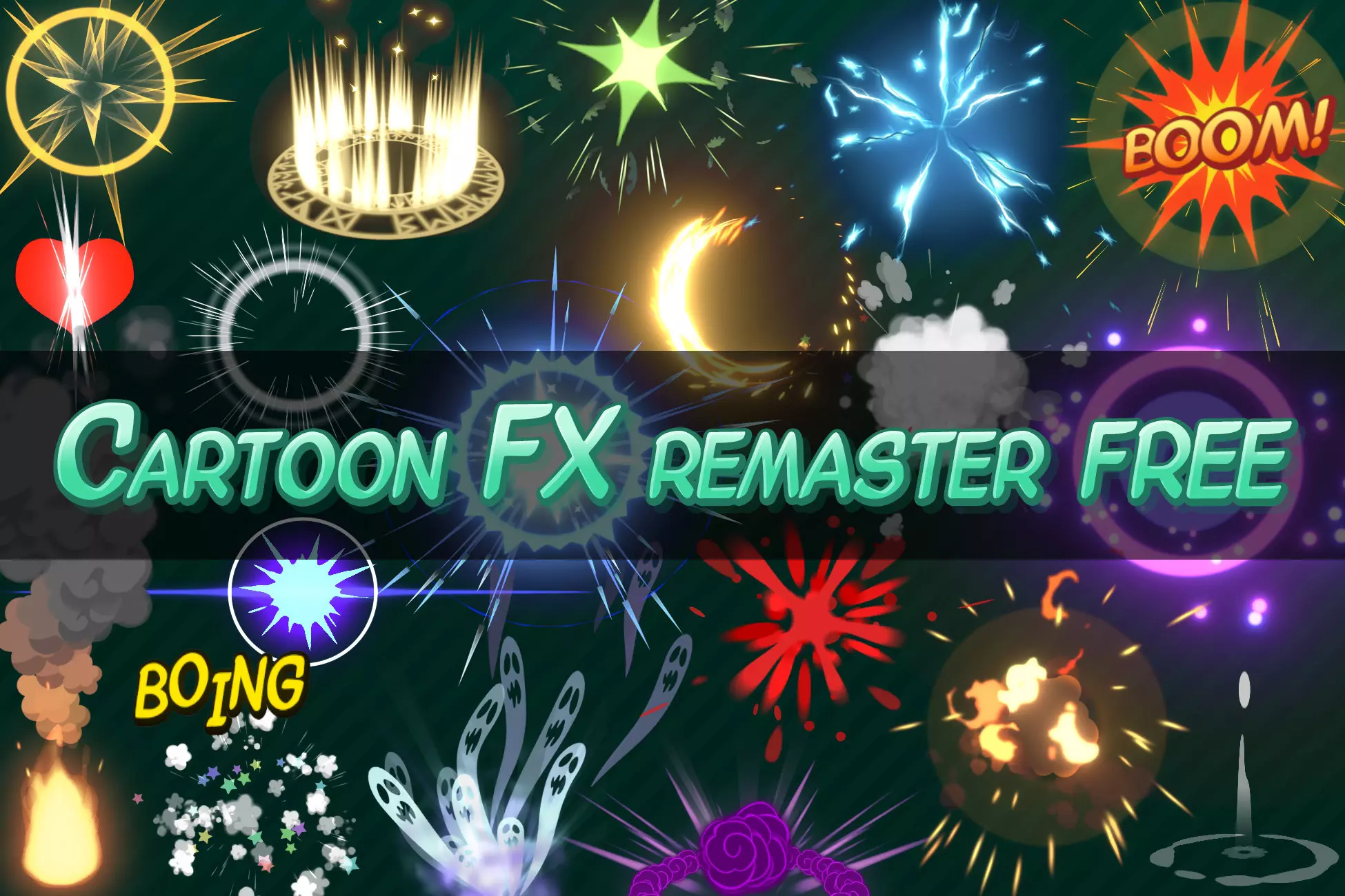
Lastly I didn’t have the time to create my own particle systems so I implemented the Cartoon FX Remaster Free Unity package. These particles effects are extremely professional for a free Unity package.
Playtesting and Finding the Fun
I had a playtesting environment set up, bi-weekly playtesting sessions with the teacher overseeing my final project (these sessions were rarely long enough for a full game) and a playtesting session with my close friends where we would have a full squad of 3 to 4 people were we would play multiple full games every other month or so.
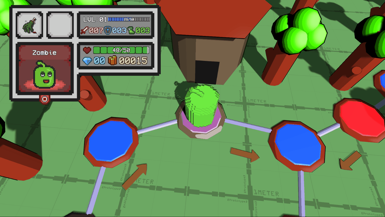
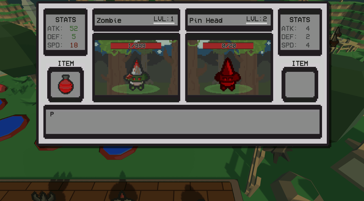
The main thing I noticed during both types playtesting was that PvP was by far the most fun part of the game. The combat was set up to be a game of rock paper scissors, which isn’t as fun against AI but extremely exciting against players when there are important resources on the line.
I added the Conflict Orb item to take advantage of this as you can very easily fight another player with this item. The Berserker class is also able to gain Conflict Orbs throughout gameplay by rolling a 10.
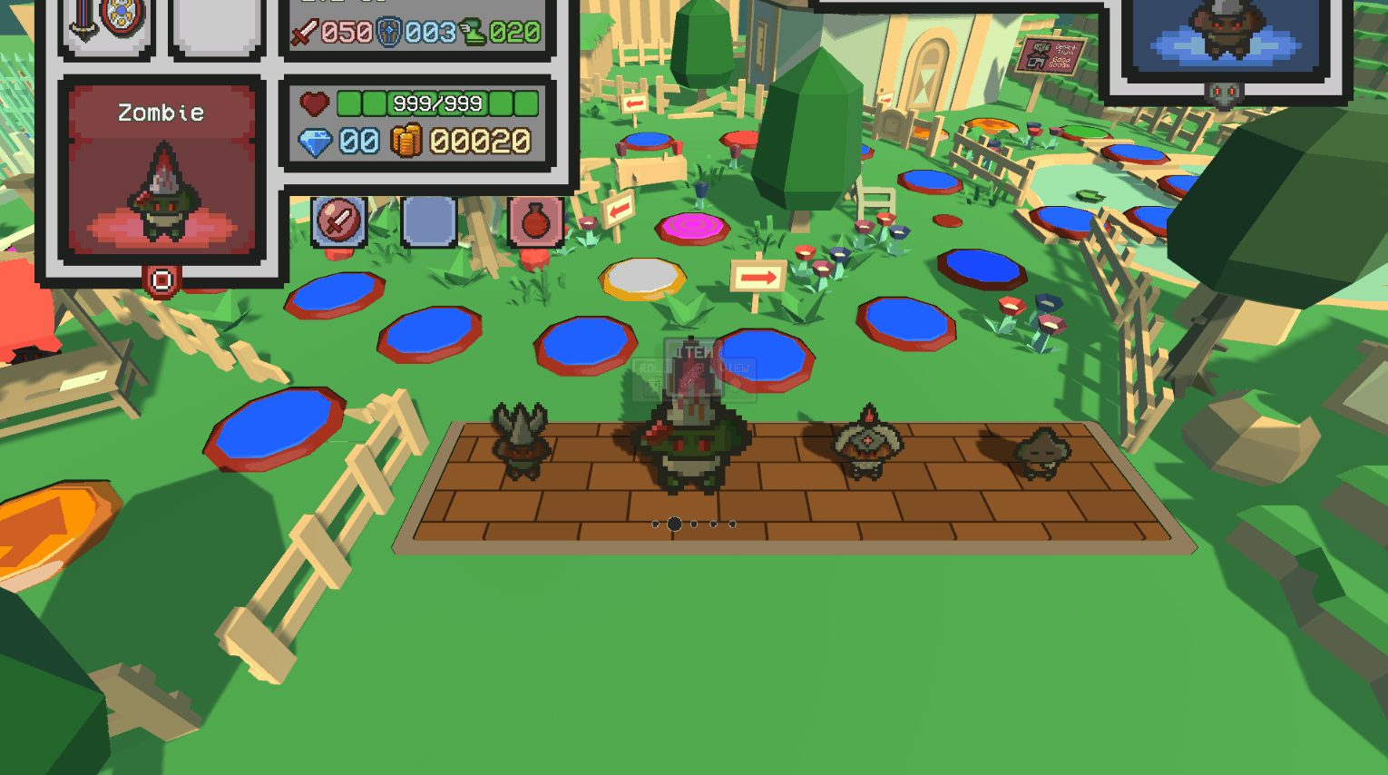
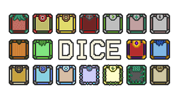
The game mainly focuses on the combat, with the majority of spaces resulting in combat against enemies. I also noticed during the playtests that one of the more fun things to do during the game was collect multiple dice. These allow the players to have more control on what spaces they’ll land and have the potential to boost specific stats or give them gold.
I originally had it so you could only gain dice through buying them from shop spaces but I later made it so not only dice but also useful items could drop from enemies. Each enemy had their own unique drops, which made finding and battling specific enemies especially exciting if you were familiar with the game.
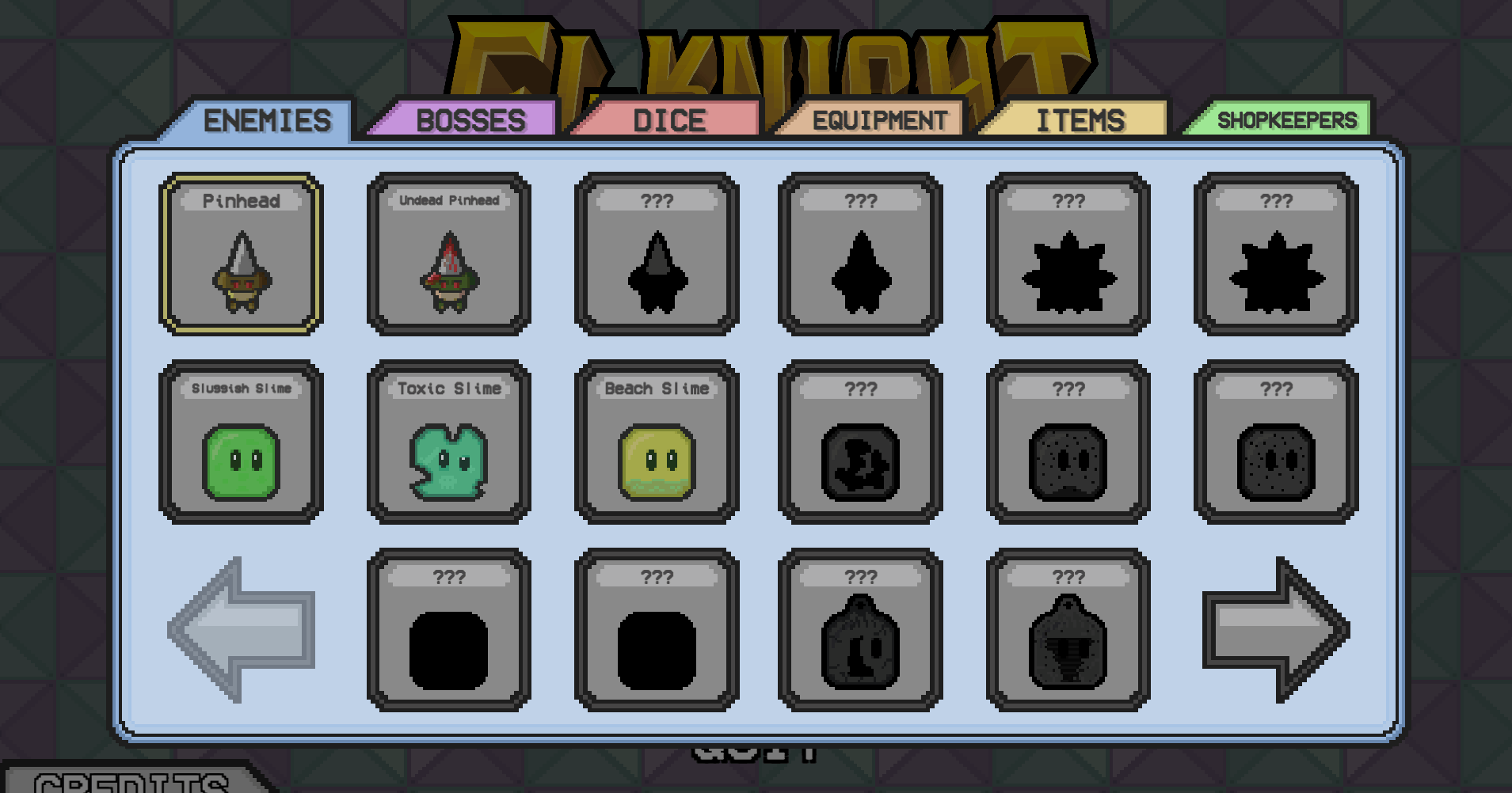
I didn’t have time to have a macro gameplay loop of unlocking new elements in game like new maps, classes or class skins. So I decided to just have everything unlocked from the start and have a side objective to unlock everything in the discovery log. This shows all the important enemy stats, what they can drop and how likely that is.
This is also a useful tool in having extra information about specific enemies or items if you were confused about a certain interactions.
Onboarding Issues
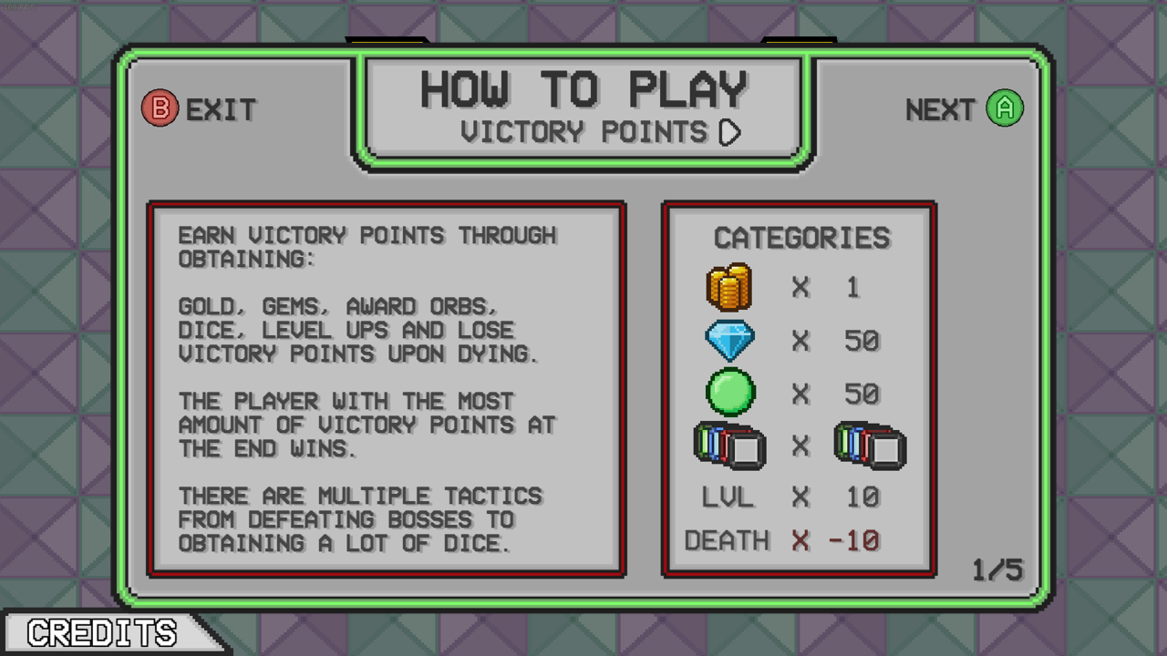
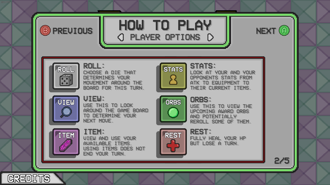
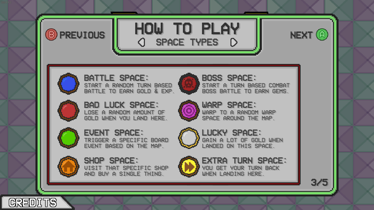
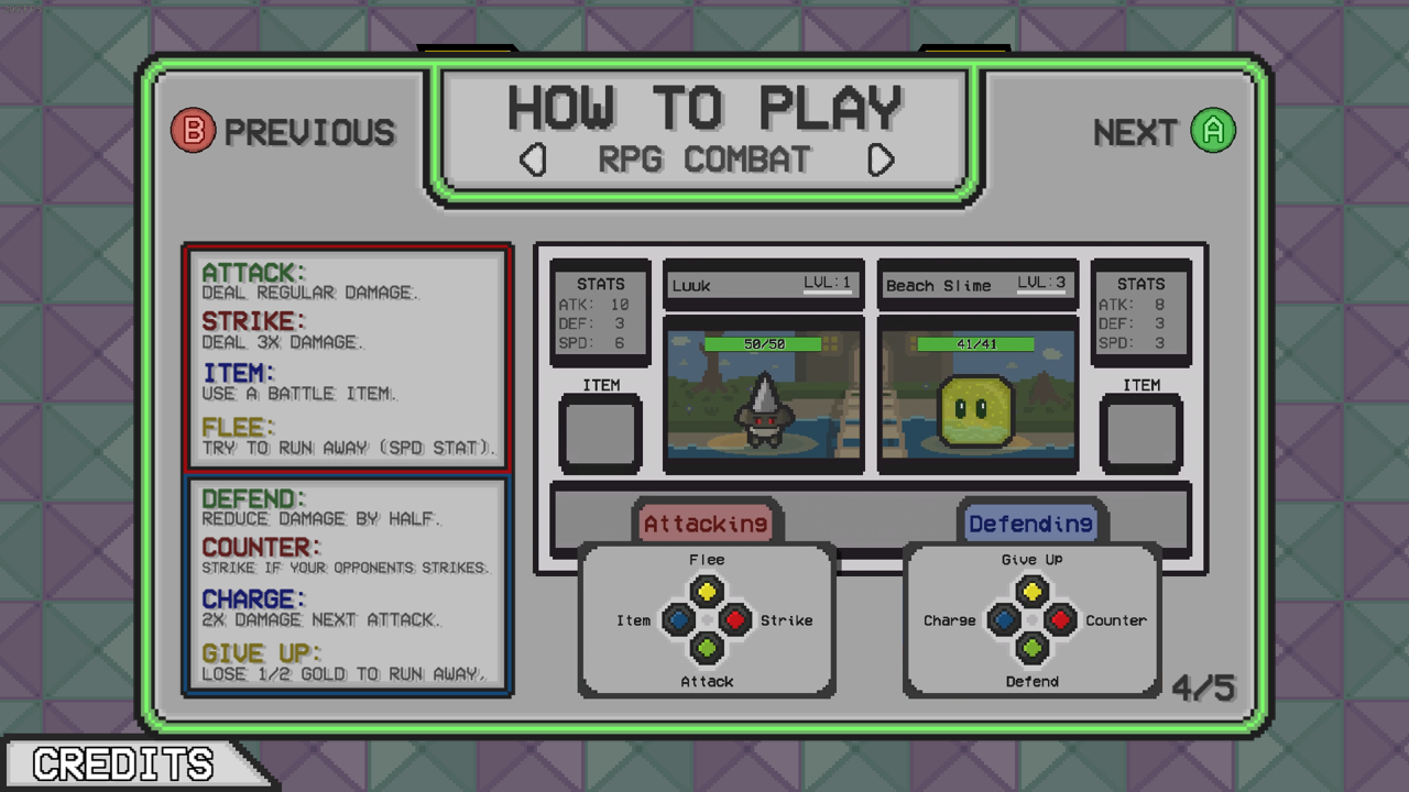
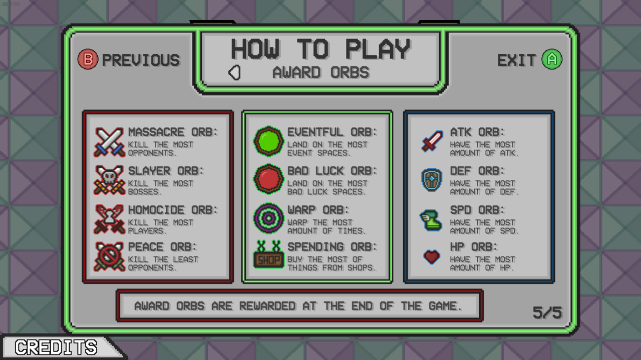
I noticed that during playtests with new players that some elements were always unclear, mainly the combat as the interaction with Strike and Counter isn’t explained anywhere. As that was the main issue I decided to implement a How to Play screen to the main menu where I not only explain the combat but also shed light on what all spaces do, what each orb does and how the player can win via Victory Points.
How to Play Screen
This was not enough though as after release I noticed that this screen was often ignored and people would just jump into a match with no clue how to play. With hindsight I should’ve added a quick explanation whenever someone plays the game for the first game. Mainly the combat, but because I couldn’t control which enemy someone would encounter first I decided to leave it as is. If someone likes the game enough but still not understand how to play they would read the how to play to see what they were missing.
UI/UX
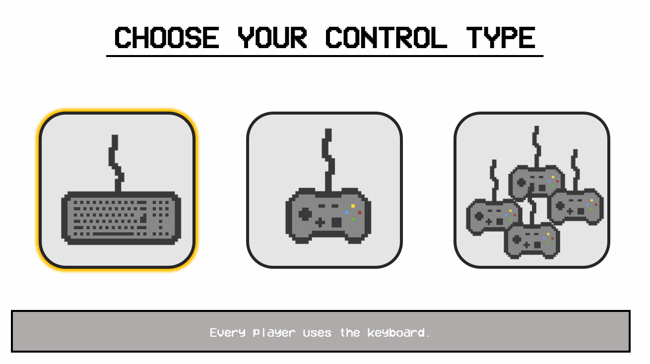
Fi-Knight Kingdom has quite a few menu’s to get through from choosing the amount of players, which controller each player uses (the same controller can be used to control multiple characters), choosing a level, how long a game will last and each player is able to create their own character.
I decided to create some simple mock-ups for these screens. I created these mock-ups via PowerPoint as I like the freedom you get with the animation tools provided there.
Assigning Players
I originally planned having 2 separate screens asking the amount of players and control scheme. During the research phase I saw that this is how a game like Mario Party handled this. Later during development I realized I could combine the two screens into a single screen. This had the benefit of having more control in what kind of control scheme each player prefers and having to go through less screen before starting the game. This screen also had some major drawbacks with the major being that it was generally less clear, but this was a compromise I didn’t mind.
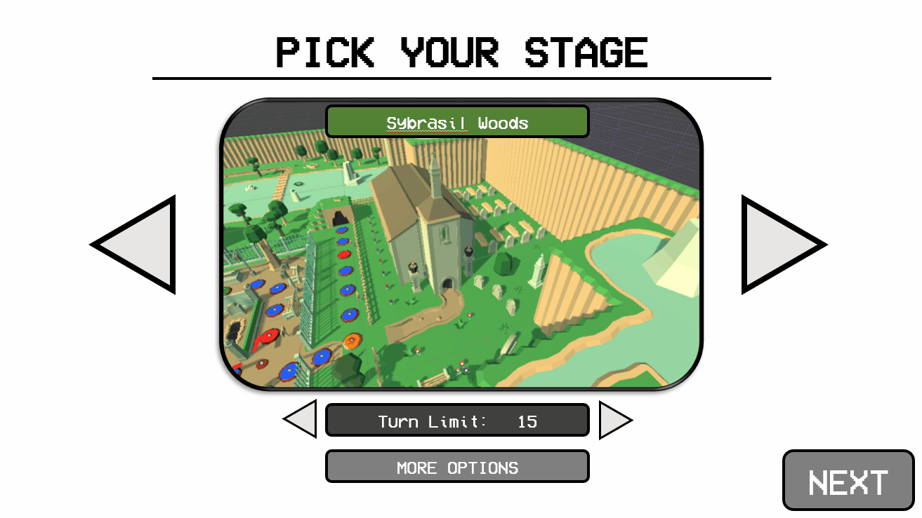
Level Select
The level select screen turned out very similarly to what I originally had planned. I did think the big arrows to the side didn’t work with the style I was going for at all so I decided to have them switch levels with the name, this made it also possible to have the amount of turns be inside the image. I originally did want to have extra options like being able to have no Award Orbs or have specific players start with a higher level. This wasn’t feasible as it wouldn’t only require even more programming, it also required an additional sub-screen which wasn’t within my scope.
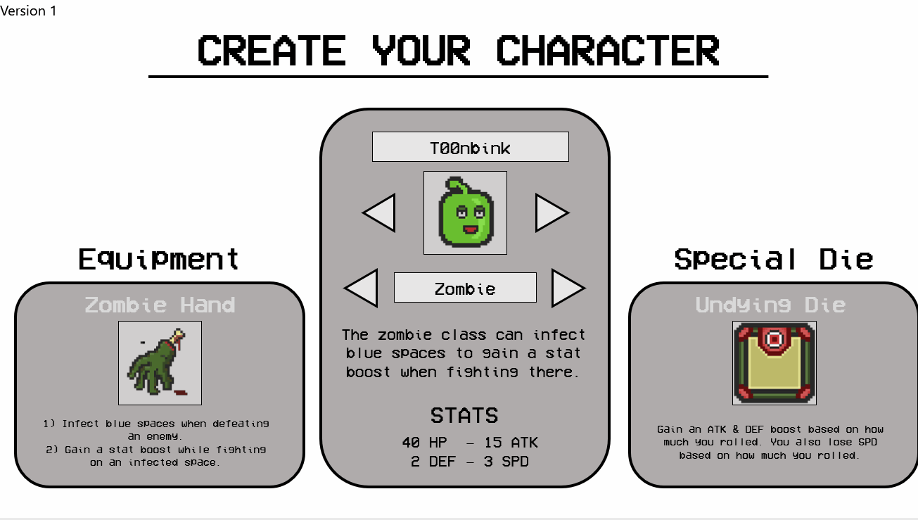
Character Creator
I didn’t change a ton about the character select, this might also be the reason this screen still has to most problems compared to the others. I’m personally not happy with the empty space above the unique die and equipment windows. It does serve its purpose well enough so I decided to focus my time on fixing actual issues.
Closing Thoughts
There is a lot of detail I didn’t go into like the release process onto Steam but I feel like I covered the most important parts of this experience and I’m very proud of what I accomplished here. I’m very happy with the overall quality and polish of the content present in the game. I’m also content with the Steam page and trailer I created.
I do think if I could recreate it I would change up the combat. It was meant to be a party game so I didn’t plan on having the combat be too complex but I still think some extra depth would’ve been nice. Have it be faster pace but also allow players to have more options during combat itself.